Picverce AI Text Clarifier for documents and signs
What the Text Enhancer reads on documents, signs, menus and receipts, what a single run costs in credits, and the blurry photos it hands back unchanged.
GuidesA photo of a page is not a scan. The camera sits at a slight angle, the light falls off toward one edge, and the phone compresses the whole thing on the way to your camera roll.
The AI Text Enhancer is the pass built for exactly that mess. It works on the letterforms rather than the picture as a whole, which is why it behaves differently from every other model in the rail.
It is also the most expensive single run in the workspace at 8 credits. Knowing in advance whether your photo is the kind it can help is worth a minute of your time.
What the Text Enhancer is built to read
The pass concentrates on the boundary between ink and paper. Where a letter stroke fades into the page, it rebuilds a defined edge and pulls the character back toward a shape your eye can name.
That applies to printed type and, less reliably, to clear handwriting. It does not apply to the room around the page.
What comes back is a picture, not a transcription. There is no text file, no copyable characters, and no spell check. You get the same photo with the writing in it made legible.
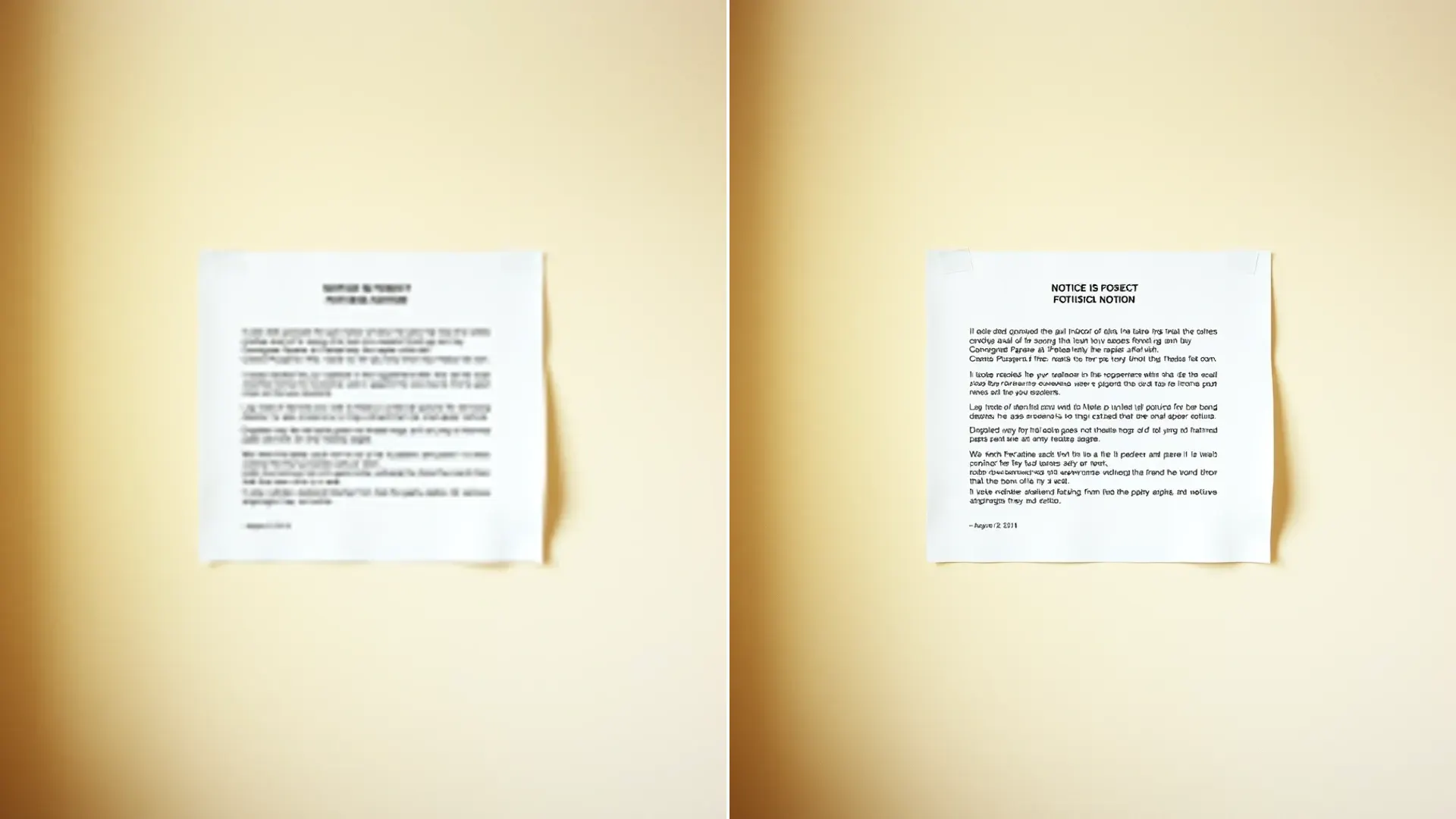
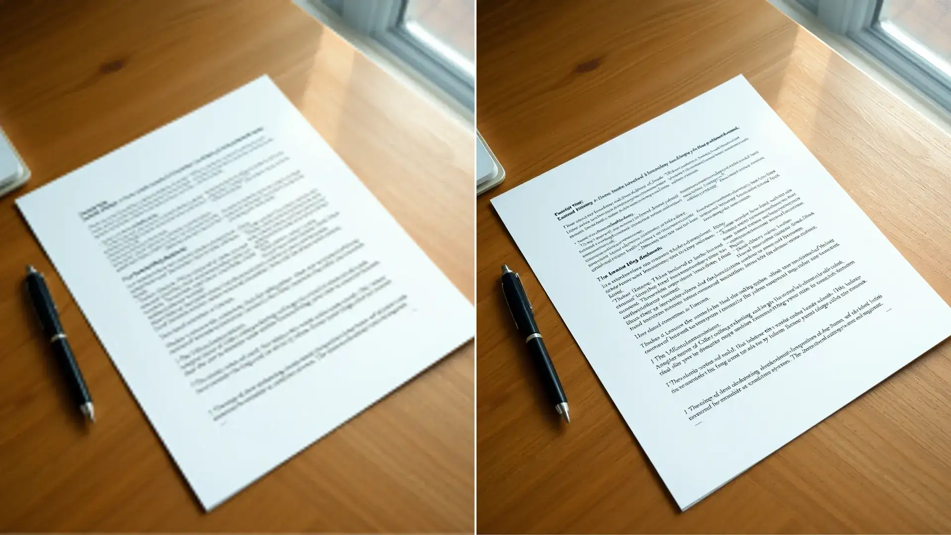
The first file I ran through it was a printed handout photographed at an angle under a ceiling light. The body text went from a squint to readable at a glance, and the page stayed a photo of a page, angle and all.
Nothing about the geometry changes. The tool does not straighten a tilted page, crop away the table underneath, or square up a perspective. Those are jobs for the crop tool in whatever app you already use.
Flat areas of the frame barely move. A plain wall behind a sign or an empty margin on a page comes back looking the same, which is a good sign rather than a fault.
Colour is left alone as well. A photo of a page lying on a wooden desk comes back with the same wood tone it went in with, because nothing in this pass touches white balance.
The before and after slider in the workspace is the fastest way to judge a result. Drag it slowly across a line of small print and you will know inside a few seconds whether the run earned its credits.
Where it sits in the model list
The workspace rail lists eight models. Image Enhancer, Image Enhancer PRO, Anime Enhancer, Photo Restore, Image Upscaler, Image Sharpener, Face Restore, and Text Clarity.
Text Clarity is the one this page opens with already selected. It has no extra controls of its own, so there is no face toggle and no scale picker to think about. You upload, you run, you compare.
Its closest neighbour is the AI Image Sharpener, which costs 2 credits and tightens every edge in the frame without caring what those edges are.
On a photo where the type is already legible and just a little dull, the cheaper pass usually gets you there. On a photo where letters have started to merge into each other, it will not.
I tested both on the same photo of a warranty card. The sharpener made the card edges and the printed logo read crisply while the small print stayed mushy. The text pass left the card edges alone and pulled the small print back.
That is the whole decision in one sentence. Dull type goes to the cheap pass, merged type goes to the expensive one.
If you are still unsure which of the two you want, Picverce AI Image Sharpener explained walks through what sharpening does and does not touch on an ordinary photo.
Documents signs menus and receipts
Four jobs come up over and over, and they behave differently enough to be worth naming.
- Documents and handouts, where the type is dense and small. This is the tool at its best, as long as each letter still occupies more than a few pixels in the original photo
- Signs and notices shot from across a street or a car park. Large printed letters survive a lot of distance, so these often come back cleanly even from a poor angle
- Menus and price boards, which mix large headings with very small item lines. Expect the headings to come back well and the smallest lines to be the ones that decide whether the run was worth it
- Receipts and labels on thin thermal paper, where the printing was faint before your camera ever saw it. Results here swing widely depending on how much ink actually reached the paper
A parking sign is the case that surprised me most. I photographed one from about fifteen metres away to check a restriction, and the time window that was unreadable on my phone came back clear enough to act on.
The common thread is size in the frame rather than size in real life. A small label filling the photo does better than a large sign occupying a corner of it.
Cropping tight before you upload is the single cheapest improvement available. It costs nothing, it drops the file size, and it hands the pass more pixels per letter to work with.
Angle matters less than most people expect. A page shot from thirty degrees off square still reads well, as long as the letters along the far edge have not been squeezed into slivers by the perspective.
What it will not bring back
There is a resolution floor and it is not negotiable. If a word occupies six pixels of height in your original, the information needed to rebuild it was never recorded.
The pass will still produce something. That something is a plausible smear rather than the words that were actually printed, which is the failure mode worth watching for.
- Motion blur from a moving hand or a moving vehicle, where the letters are smeared sideways rather than softened
- Text photographed so far away that individual characters are only a few pixels tall
- Screenshots of screenshots, where the compression pattern has already been baked in twice
- Handwriting in a loose cursive, since the tool has no reliable shape to pull each stroke back toward
- Glare across the page from a flash or a window, because the letters under the bright patch were never captured at all
I lost 8 credits learning the glare one. A laminated notice photographed with a window behind me came back with the shaded half sharp and the reflective half still a white blank.
Reshooting is almost always cheaper than a second run. Step to one side, kill the reflection, and the same tool will do far better on the second photo than it ever could on the first.
Very heavy compression is the quieter version of the same problem. A photo forwarded through three chat apps has lost real letter detail at every hop, and none of those hops can be walked back.
Low light is the other quiet one. A page photographed in a dim room carries sensor noise mixed into every letter stroke, and the pass has to guess which speckles are ink and which came from the camera.
Credits limits and a working routine
A run costs 8 credits. The free plan refills 10 credits a day, which means one run and a little change, so a free account gets one serious attempt per day at this particular job.
Paid plans move to a monthly pool instead. Basic gives 400 credits, Standard 1000, and Premium 2500, shared across every tool in the workspace rather than reserved per tool.
Credits come off only when a run finishes. A rejected upload or a failed job costs you the wait and nothing else.
There is no batch mode, so a folder of twenty photographed pages means twenty uploads and twenty runs. At 8 credits each that adds up quickly, which is worth planning around before you start rather than halfway through.
Uploads are capped at 5 MB, and the picker accepts JPEG, PNG, WEBP and HEIC. Your browser converts and compresses the file before it leaves your machine, which is also why a PNG with a transparent background comes back flattened onto a solid backing.
That cap applies to the file as you hand it over, before any of the browser side work. A photo from a recent phone usually lands well under it. A flatbed scan at high resolution sometimes does not.
My routine now takes about thirty seconds and has saved me a lot of credits. Crop to the text, check the crop is still sharp at full zoom, then run once and compare with the slider before downloading anything.
If the first run does not get there, a second run on the same file will not either. At 8 credits a go, the honest next step is a better photo rather than another attempt at the same one.