Picverce AI Graffiti Generator lettering
Six lettering styles, the quote trick that gets your word spelled right, and why the surface you name changes the piece more than the colours do.
GuidesGraffiti is the one theme on the site where the text is the subject. Everywhere else words are a problem to route around. Here they are the whole point.
That makes the AI Graffiti Generator behave differently from every other theme, and it means the usual advice about leaving text out of your prompt does not apply.
What follows is how the lettering styles differ, how to get a word spelled correctly, and what the surface does to the result.
The theme is a starting grid on the generation workspace rather than a separate engine. Everything you learn about settings elsewhere still holds once you are inside.
A photo attached on the landing page also carries in as a reference for the first run, which is useful when you want a piece on a wall you actually photographed.
Six lettering styles and what each does to a letter
The grid carries six styles plus a No Style option.
- Wildstyle. Interlocking, distorted, arrow heavy letterforms. The classic look and the least readable by design.
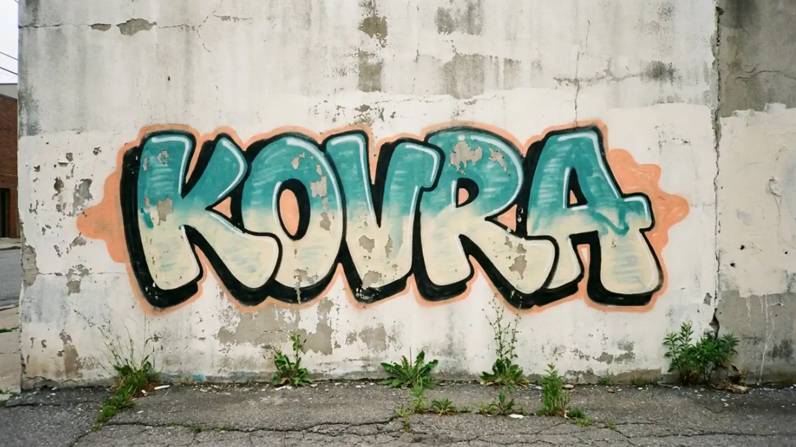
- Bubble or throw-up. Rounded, inflated letters with a thick outline. The most readable of the six.
- Stencil art. Flat cut shapes with bridges, closer to a spray template than to freehand.
- Optical 3D. Letters with depth and a cast shadow, built to look like they leave the wall.
- Cyberpunk neon. Glow and saturated colour layered over the letterforms.
- Street mural. The one that is not really lettering. Wall scale imagery with words as a small part.
Read that list as a readability gradient rather than as six flavours. Bubble at one end, wildstyle at the other.
That matters because people pick wildstyle for the look and then complain the word is unreadable. Wildstyle distorts letters on purpose. Legibility dropping is the style working, not failing.
When I ran the same four letter word through all six, bubble came back spelled correctly on the first attempt and wildstyle took four tries to produce something I could still read.
Optical 3D sat in the middle and was the best compromise when the word had to be readable and still look like a piece rather than a logo.
Street mural is the outlier worth knowing about. Pick it expecting a tag and you get a scene with lettering somewhere in it.
No Style is a genuine option here rather than an absence. It hands your description straight to the model, which is useful when your prompt already names a lettering style in words.
Cyberpunk neon is the one that most often surprises people. It keeps the letterforms and adds glow, which reads well on a dark surface and washes out on a pale one.
Pair it with a night scene or an underpass and it works. Put it on a sunlit brick wall and the glow has nothing to sit against.
How to get your word spelled right
Two rules do most of the work, and both are on the landing page for a reason.
Put the word in quotation marks inside your prompt. Marking it as a literal string rather than a description measurably improves how often it comes back correct.
Keep it short. One word beats two, and four letters beats eight. Every extra character is another chance for the model to invent a shape.
Single words in bubble or block lettering are the most reliable combination available. If the spelling has to be right, that is the pairing to start from.
Names work better than phrases. A crew name, a nickname or a single noun all survive far more often than a sentence.
Numbers are worse than letters everywhere in image generation and graffiti is no exception. Treat a year or a house number as a coin flip.
Check the spelling at full size before doing anything else with the result. A wrong letter in a wildstyle piece is genuinely hard to spot in a thumbnail and obvious once printed.
Budget several attempts rather than one. Even with quotes and a short word, spelling is the thing that varies most between runs of the same prompt.
If four attempts all come back wrong, shorten the word or move down the readability gradient. Fighting wildstyle for legibility is a losing argument.
Naming the lettering style in words as well as picking it from the grid helps a little. Saying block lettering in the prompt reinforces what the preset already asked for.
That doubling is cheap and it costs you nothing if the preset was already going to do it.
The surface is half the piece
This is the part most people leave out of the prompt, and it changes the result more than the colour does.
Naming a surface tells the model how the paint should sit. A brick wall breaks the letters across mortar lines. A roller shutter puts hard vertical ridges through them.
- Brick wall. Texture through the letters, slight colour bleed at the edges.
- Concrete underpass. Flat and grey, which makes bright colours read strongest.
- Roller shutter. Vertical corrugation that fragments anything painted across it.
- Subway car. Panels, rivets and windows interrupting the piece.
- Freight train. Weathered metal and existing marks under the paint.
Concrete is the safest choice when the word has to be readable, because nothing in the surface competes with the letters.
A roller shutter is the opposite. It looks authentic and it will chew a wildstyle piece into something unrecognisable.
Adding one surface word to a prompt that already had a style and a word is usually the single change that makes a flat result look real.
Lighting is the next word worth adding after the surface. Overcast daylight, late afternoon sun and a streetlight at night all change how the colours read.
A piece under a streetlight looks photographed. The same piece with no lighting named looks like a flat illustration of graffiti.
The aerosol qualities come along with it. Drips, overspray and shading appear because the surface makes them make sense, not because you asked for them separately.
Ratios credits and rights
There are three ratio tabs. Portrait gives 9:16, Square gives 1:1, Landscape gives 16:9.
Landscape is the right default for graffiti and it is the one people forget to set. Almost every real piece is wider than it is tall, and a tall frame forces the model to stack letters in ways that look wrong.
A fourth option, Match Input Image, appears only when the model supports it and you have uploaded a reference. It is conditional rather than locked behind a plan.
The settings panel shows a credit figure with the model and the resolution named directly beneath it. Change either and the figure moves, so read the panel rather than memorising a number.
Variations multiply that cost, and how many you can request at once is set by the model rather than by the theme.
Because spelling takes several attempts, draft at the lowest resolution the model offers. Settle the word and the style cheaply, then regenerate the one you liked at full size.
Paid plans include commercial rights, which covers apparel, album art, posters and client work. Free credits cover personal projects.
That distinction matters here more than on most themes, because graffiti output ends up on t-shirts and record sleeves more often than it ends up framed.
Check which side of that line your project sits on before you build a run of shirts around a piece.
All of it runs through the generation workspace once you submit, so nothing about the theme limits what you can change afterwards.
Where graffiti pieces come back wrong
Four failures account for most of it.
The first is a misspelled word nobody checked. Quote the word, keep it short, and look at the result full size.
The second is wildstyle picked for the wrong reason. If the word has to be read, the style fighting you is the style doing its job.
The third is a missing surface. A piece floating on a plain background looks like a font sample rather than graffiti.
The fourth is a portrait frame on a horizontal subject, which produces cramped stacked lettering that no amount of rerunning fixes.
There is a sixth that only shows up later. A piece drafted at low resolution while you fixed the spelling looks fine on a screen and falls apart printed large.
Once the word is right, generate that exact prompt again at the highest resolution the model offers before committing it to anything physical.
A fifth worth naming is a reference image nobody meant to attach. A photo added on the landing page carries into the first run and keeps pulling results toward a picture you stopped thinking about.
The habit of writing a prompt that survives a change of model applies here too, and that argument is worked through in write a prompt that survives the model.
Quote the word, pick a style by how readable it needs to be, and name the wall. Those three decisions cover almost everything.