Picverce AI Image Colorizer for black and white photos
How the Picverce AI colorizer decides what colour something was, which photos it reads well, and why the result is believable rather than true.
GuidesA black and white photo does not contain hidden colour. There is nothing to recover, only something to decide.
That single fact explains everything about how the AI Image Colorizer behaves, including the parts people find disappointing.
The pass is making educated guesses. Understanding what it is guessing from tells you when to trust it.
It is also one of the few tools here with no settings at all, which makes the input and your expectations the only two things you control.
How it decides what colour something was
The model identifies what things are before it colours them.
It picks out objects, people, clothing and landscape features, then applies colour that suits each one in context.
So it is not painting by brightness. It is recognising a jacket and then choosing a colour a jacket plausibly was.
That is why it does not smear. Colour stops at the edge of the thing it identified rather than bleeding across a tonal boundary.
It is also why an object it cannot identify comes back desaturated. Unrecognised things get a cautious grey rather than a confident guess.
Those choices come from learned patterns across three areas in particular.
- Skin tones, which it handles with more confidence than anything else in a photo.
- Clothing of a period, where it leans on what people in that kind of picture typically wore.
- Environments, meaning grass, sky, brick, wood and water all have strong expected colours.
That ranking is worth remembering. Faces and landscapes come back convincing far more often than a specific garment does.
The reason is how much variation each category allows. There are only so many plausible skin tones and a great many plausible jumper colours.
Anything with a narrow range of real answers comes back right. Anything with a wide range is a coin toss dressed up as a decision.
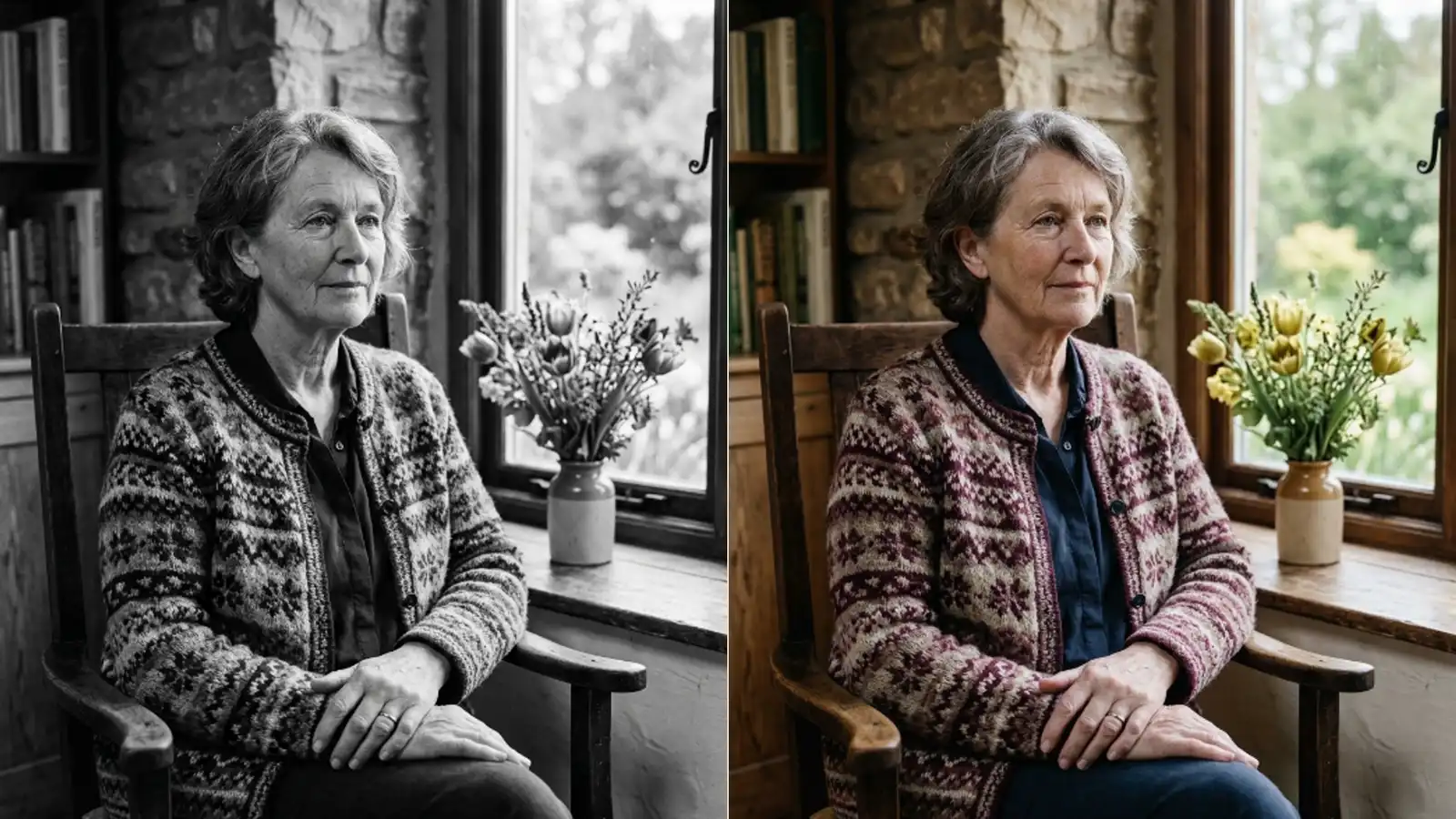
Original detail is preserved underneath. The colour is laid over the existing tones rather than replacing them, so texture and grain survive the pass.
That sets expectations about sharpness. A soft print stays soft, and a grainy one stays grainy, just in colour.
Colourising is not a repair pass and does not pretend to be one. Nothing about it improves the underlying photograph.
When I colourised a 1950s street photo, the pavement, sky and skin all landed. One coat came back brown and the family remembered it as red.
Neither result was a failure. One was predictable and one was not.
Brown is what most coats in most photographs of that era were. The model answered correctly about coats in general and wrongly about that coat.
Believable is the goal not accurate
This is the part to be clear about before you show a colourised photo to a relative.
Exact historical accuracy cannot be guaranteed for every detail. Where the original colour is unknown, the model picks something realistic instead of something correct.
Those are different claims and the gap between them matters for family photographs.
A red dress and a green dress can produce the same grey. Nothing in the file distinguishes them, so the model chooses the more common answer.
Monochrome film also responded differently to different colours depending on the stock, which means the same red is not even reliably the same grey.
None of that information reaches the model. It sees a grey and knows nothing about the film that made it.
That is why unusual colours are the ones it misses. A bright yellow car in 1962 reads as a normal car, and normal cars were not yellow.
Ask somebody who was there before you print it. A relative who remembers the coat is better information than any model has.
Two people remembering differently is also useful. It tells you the detail was never certain and the colourised version is as good a guess as theirs.
Keep the black and white version too. Colourisation creates a new file and leaves your original untouched, which is the right way round.
For archive work, treat the colour version as an interpretation and label it as one. The monochrome scan stays the record.
That distinction matters more the older the photograph is. A picture from the 1970s has living witnesses and a picture from 1890 does not.
Nobody can check the 1890 result, which is exactly when a confident wrong answer causes the most trouble.
Which photos read well
The pass works from what it can recognise, so recognisability is the whole game.
- Clear, well lit scans give it the most to identify and produce the most confident colour.
- Family portraits and wedding photos do well, because faces and skin are its strongest area.
- Landscapes and street scenes do well, since grass, sky and buildings have expected colours.
- Older or slightly worn photos still work. Damage reduces confidence without stopping the pass.
Sepia prints colourise as readily as true black and white. The existing warm cast does not confuse it.
Hand tinted prints are the odd case. Those already carry colour decisions somebody made, and running them through adds a second opinion on top of a first.
Very dark or very washed out scans are the weak case. A face lost in shadow has nothing for the model to recognise, so it stays muddy.
Lifting the exposure slightly before uploading helps here, and it is one of the few things you can do to steer a tool that has no steering.
Close crops beat wide shots for the same reason they do everywhere. More pixels on the thing you care about means more attention paid to it.
Group photographs are the common disappointment for that reason. Twenty faces share the attention one face would have had to itself.
Splitting a large group into two or three crops and colourising each is more work and gives visibly better faces.
Accepted formats cover PNG, JPEG, JPG and WEBP, so a scan or a phone photo of a print both go in without conversion.
A photo of a print works better than people expect, provided the light on it is even. A window and a steady hand beat a bad scan.
What a run costs and how long it takes
Each colourisation costs three credits.
There are no settings to get wrong. No strength slider, no palette choice, no style. You upload and it decides.
That makes the tool simple and it also means a result you dislike cannot be nudged. Your options are to accept it, crop tighter and try again, or take it into an editor.
Running the same file twice gives close to the same answer. There is no random seed to roll again, so repeating without changing anything is a wasted three credits.
Most images finish in a few seconds, depending on size and complexity. You can look at the result and download it straight away.
Complexity matters more than size. A crowded street scene takes longer than a portrait at the same resolution because there is more to identify.
Free credits cover a limited number of runs and an account raises that. Paid plans also allow larger uploads, so file size is one of the things a plan changes.
That upload ceiling is the practical limit on how large a scan you can send. It is worth checking before scanning a whole album at maximum quality.
Compared with commissioning manual colourisation, which takes an artist hours, three credits and a few seconds is a different kind of decision entirely.
It changes what you are willing to attempt. Nobody pays an artist to experiment on a photograph they are unsure about, and three credits buys exactly that.
Where colourising fits in a sequence
Old photos usually need more than one pass, and the order changes the result.
Repair the damage first. Sending a scratched print to the colouriser means the AI Photo Restoration tool never gets a clean shot at it, and the colour pass has to interpret the scratch as part of the picture.
A crease across a face gets coloured like a feature. Remove it first and the face is read as a face.
The same logic applies to heavy dust and spotting. Anything the model might mistake for part of the picture is worth removing while it is still obviously damage.
Resize last if you are printing. Colour decisions are made on what the model can identify, and enlarging afterwards does not change any of them.
Colourising an already enlarged file is not wrong, it is just paying to process more pixels for the same answer.
That gives a three step order for a damaged monochrome print. Repair, colour, then enlarge.
Each of those three is a separate tool and a separate charge, and none of them can undo a bad decision made by the one before.
Each step costs credits, so run them in that order once rather than discovering it backwards.
The argument about which of the first two comes first is worked through in detail in colorizer before or after restore.
Trust it on skin, sky and grass. Question it on a specific garment. Keep the monochrome file either way.