A streamer emote sheet from one prompt
A small streamer built a set of channel emotes from a single creature description. What held the set together and which expressions needed a second pass.
MarketingEmotes have a strange requirement. They have to read at twenty eight pixels and they have to look like they came from the same hand.
A streamer I know had eight commissioned emotes from three different artists and the set looked exactly like what it was.
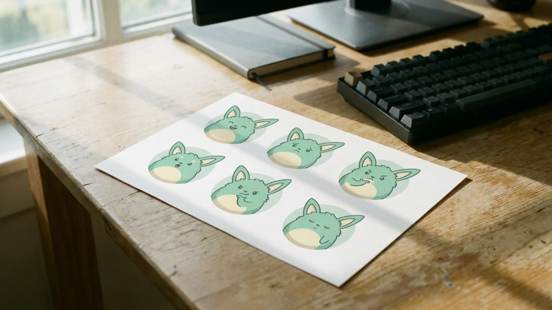
One creature, six expressions
She built a replacement set from the AI Pokémon generator, which is aimed at creature design and carries five styles plus a No Style option.
Classic watercolour, modern 3D, pixel art, trading card illustration and chibi or cute. She picked chibi and never changed it.
That was the decision that mattered. Chibi means big head, small body and large eyes, which is the only proportion that survives being shrunk to a chat window.
Pixel art was the other candidate and she rejected it after two tries. It reads perfectly small and looks dated next to everything else on her channel.
Trading card illustration was never in contention. It is built for a framed card with a border, and a border is wasted space in a chat window.
Classic watercolour and modern 3D both lost for the same reason. Soft edges and rendered lighting are detail that disappears at emote size.
She wrote one creature description, saved it, and changed only the expression clause for each emote. Happy, crying, angry, sleeping, confused and cheering.
Keeping the creature paragraph byte identical across six runs is what made them look like a set. Any drift in the description and the colours shift.
She pasted from a note rather than retyping. Retyping a description introduces small changes you do not notice and the output does.
What stayed consistent and what did not
Three things held. The palette, the general body shape and the style of the eyes.
Eyes mattering most was the surprise. At twenty eight pixels the eyes are most of what a viewer sees, and a consistent eye style covers a lot of other drift.
Two things drifted. The exact shade of the body colour moved slightly between runs, and one ear was longer on two of the six.
Neither mattered at emote size. She checked by shrinking every candidate to twenty eight pixels in a preview before judging it, which is a habit worth stealing.
Judging an emote at full resolution tells you almost nothing. Detail you can see at full size is detail that will not exist where it is used.
She built the preview by dropping candidates into a document and scaling them down. Nothing clever, and it caught three emotes that looked great and read as blobs.
The expressions that worked first time were the loud ones. Angry and crying both have obvious silhouettes.
Confused took five attempts. A tilted head and a question mark are small signals, and small signals disappear.
She solved it by making the pose more extreme rather than by rewording the emotion. Asking for an exaggerated shrug did what asking for confused could not.
That generalises. Emotion words are abstract and the model has to interpret them. Pose words are concrete and it just draws them.
Sleeping worked the same way. Asking for closed eyes and a curled body beat asking for sleepy.
The one that needed a second tool
Sleeping came back with the creature curled correctly and the wrong colour on one limb.
Rather than regenerate and risk losing the pose, she took it into the AI Image Editor and asked for that one limb recoloured with everything else preserved.
That is a useful pattern for any set. When a generation gets the hard part right and one detail wrong, editing is cheaper than rerolling.
Rerolling a pose you liked is a gamble. Fixing a colour on a pose you already have is not.
The edit route needs the same preservation clause any edit needs. Name the limb, name the colour, and say everything else stays as it is.
She used square ratio for all six, which is what emote platforms want, and drafted at the lowest resolution the model offered because the final files are tiny anyway.
Reference images were the one thing she did not use. Attaching an early emote as a reference for the next pulled the pose across as well as the style, which is the opposite of what a set needs.
The credit figure follows the model and resolution you select, so six low resolution drafts plus one high resolution keeper per emote is a modest spend.
What she would do differently
Three things, and she is direct about all of them.
She would write the creature description with fewer adjectives. The first version had nine and the drift between runs got worse the longer it was.
She would generate all six in one sitting rather than across two days. Coming back later meant she had changed her mind about small details and the set shows it.
She would decide the background at the start. Four of hers have a soft glow behind the creature and two do not, which is visible when they sit in a list together.
None of that is about the tool. It is about treating a set as one job rather than as six jobs that happen to share a subject.
Her channel has the set up now and the thing she notices is that nobody comments on the art. That is the outcome she wanted, since an emote set that draws attention to itself is failing at its job.
The mismatched set before it got comments constantly and none of them were kind.
The same discipline of writing one description and varying one clause is what makes a campaign image reusable, which is covered in a campaign hero from a text brief.
One creature paragraph, one style, one ratio, six expression clauses. The set holds together because almost nothing was allowed to change.