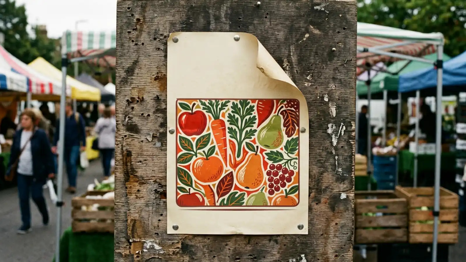
A weekend market poster I actually printed
Making a real poster for a village market with the Picverce AI Poster Generator, including the part where the printed version needed a redo.
MarketingOur village runs a market on the first Saturday of the month. For two years the poster was a photograph with the date typed over it in the wrong font.
I offered to redo it. What follows is what worked, what cost me a second run at the printer, and what I would do differently.
None of it needed design skill. It needed two decisions made in the right order and one mistake I am still slightly annoyed about.
The brief was smaller than I thought
A poster for a noticeboard needs three pieces of information and one picture. The name, the date and the place.
Everything else I wanted to include was me being precious about it. Stall counts and parking notes belong on the website.
A noticeboard poster is read from about three metres away by somebody walking past. That is the whole design constraint.
Typing a description into the AI Poster Generator drops you into a grid of ten poster presets, and the names are commercial jobs rather than looks.
Festival was the obvious pick and the wrong one. It filled the frame edge to edge and left nowhere for three lines of text.
Promo Sale and Product Launch were wrong for a different reason. Both expect something being sold, and a village market is not one product.
Minimal Clean gave me a composition with genuine empty space in the upper third. That is what a poster actually needs.
The preset is choosing a composition with a hole in it, not just a colour scheme. That reframing is what made the grid make sense to me.
The lesson took two runs. Pick the preset by how much room your words need, not by which sample looks best on its own.
Vintage Poster was the one I nearly used on looks alone. It was beautiful and it had a busy border eating exactly the space I needed.
I did not ask it for the words
This was the decision that saved the whole thing.
Readable text inside a generated image is still the hardest thing to ask for, and a date is a number, which is worse than a word.
I tested it anyway because I wanted to be wrong. Four attempts produced four different spellings of our village name.
So I generated a background with deliberate empty space and set the type myself afterwards.
Describing the empty space as part of the scene is the trick. I asked for a plain painted wall behind the stalls, which is something a model draws happily.
Asking for room for a headline does nothing. Asking for a wall gets you the same thing in a language the model understands.
A clear sky works the same way, and so does a plain table surface. Anything a model draws happily and flatly is space you can type on.
The type went on in a free layout tool in about fifteen minutes. Real type, correct spelling, and I fixed a wrong date without paying for another generation.
That last part actually happened. The market moved a week and I changed one line in thirty seconds.
The run that cost me a reprint
I drafted at the lowest resolution while I sorted the composition, which was correct.
Then I took that same low resolution draft to the printer, which was not.
It looked fine on my screen and came back soft on A2. The stall canopies had a mushy edge that nobody would notice on a phone and everybody noticed on a noticeboard.
Regenerating the same description at the highest resolution the model offered fixed it. The composition came back close enough to be the same poster.
Close enough is the honest description. A few stalls were arranged differently and none of it mattered, because I had never promised anybody a specific arrangement of stalls.
If the exact composition had mattered, that regeneration would have been a real risk rather than a formality.
That is the sequence to copy. Settle the picture cheaply, then regenerate the keeper at full size before anything physical happens.
There is no fixed price for a run. The settings panel shows a credit figure with the model and resolution named underneath, and both of those move it.
Reading that panel rather than assuming is the habit. My draft runs and my final run did not cost the same, which is the point.
Variations multiply it too, and how many you can ask for at once is decided by the model rather than by the poster theme.
Three things I would change
Ratio first. I set Portrait early by luck rather than judgement, and a square composition would have lost the empty space off the sides.
There are three tabs and only three. Portrait, square and landscape, with a fourth match option that appears only when the model supports it and you have attached a reference.
Fewer elements in the description. My first attempts named stalls, bunting, a church tower and an autumn palette, and came back crowded.
Stripping it back to a row of stalls against a plain wall gave a better poster. Crowded is the one thing a poster cannot be.
Three elements is about the ceiling. A subject, a setting and a mood, and then stop typing.
And I would check the rights question earlier than I did. Paid plans include commercial rights, free credits cover personal projects, and a village market poster is a conversation worth having before printing fifty.
Everything happens in the generation workspace once you submit, so the theme only decides which grid you land on.
The preset behaviour and the ratio tabs are covered properly in Picverce AI Poster Generator layout.
Leave room, set the type yourself, and regenerate at full size before you print. The market poster is on the noticeboard now and nobody has asked who made it, which I am taking as a win.