Picverce AI Poster Generator layout
The ten poster presets and three ratio tabs in the Picverce AI Poster Generator, why the style names are briefs, and what to do about the words.
GuidesA poster is a picture with a job. Something has to be read, and that single fact shapes every decision in this tool.
Typing into the AI Poster Generator carries your prompt into the generation workspace with a poster theme attached, so the style grid you land on is built around posters rather than pictures.
Understanding what that grid assumes is most of what makes the tool worth opening.
The theme is a starting position rather than a separate engine. Once you are inside the workspace every setting behaves the way it does for any other kind of picture.
What changes is the grid you land on and the assumptions baked into it.
The style names are briefs
Ten presets sit in the grid alongside a No Style option. Read their names and notice what they describe.
- Promo Sale, Luxury Brand, Festival, Product Launch. Four commercial jobs rather than four looks.
- Minimal Clean, Vintage Poster, Pop Art, Paper Cut. Treatments, but ones that still assume a message.
- C4D 3D and Cyberpunk Neon. The two that lean hardest on rendering style.
Compare that to a decorative art grid where every name is a technique. Here most names carry an assumption about what the poster is for.
That assumption is doing real work. Promo Sale expects a price somewhere. Product Launch expects a product with space around it.
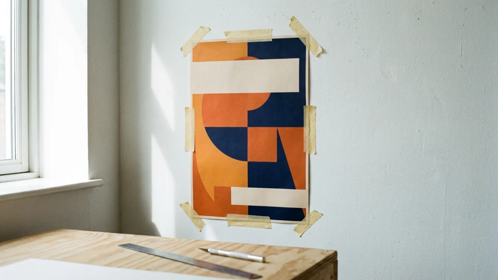
So the preset is not only choosing colours, it is choosing a composition with a hole in it where your message goes.
When I ran the same prompt through Minimal Clean and Festival, the Festival version filled the frame edge to edge and the Minimal Clean one left half the canvas nearly empty. Neither was wrong, they were reserving different amounts of room.
Pick the preset by how much space your text needs, not by which sample looks best on its own.
Festival and Product Launch differ less in colour than in density. One expects a crowd of elements, the other expects one object with air around it.
Reading the name as a brief rather than as a filter is the shift that makes the grid useful.
Cyberpunk Neon is worth a separate warning. It appears on several theme grids across the site and it is the one that most reliably drags a subject somewhere you did not ask for.
A product shot under that preset stops being a product shot. If the poster has to sell something specific, pick from the four commercial names instead.
No Style is a real option rather than an absence. It hands the model your prompt without a treatment layered on top, which is the honest baseline if you already know what you want.
Run it there first. If the result is close but plain, then reach for a preset to give it a look.
The words are the hard part
This is the thing to settle before spending anything, because it changes how you write the prompt.
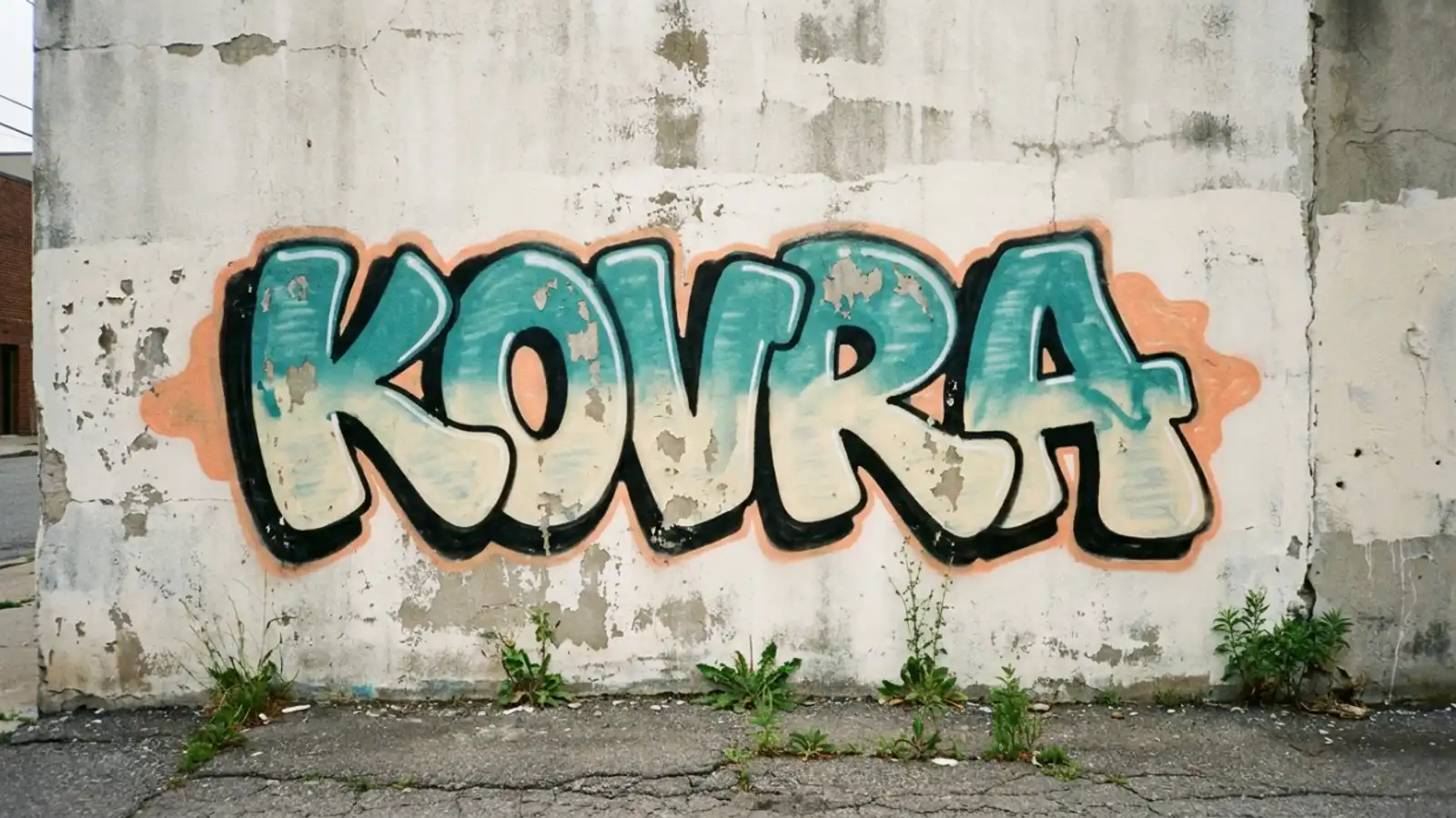
Legible words inside a generated image remain the hardest thing to ask for. Results vary by model and short words do better than sentences.
A preset arranged for text does not render text for you. It leaves room and expects something to fill it.
The reliable route is to generate the poster without the words and set the type yourself afterwards in whatever layout tool you already use.
That gives you a clean background, real type that is actually readable, and the ability to fix a spelling mistake without paying for another generation.
If you do want the model to attempt a word, keep it to one or two and expect several attempts. A band name works far more often than a tagline.
Leaving the words out of the prompt entirely is worth trying even when you want them. A composition with deliberate empty space is more useful than one with letter shaped decoration in it.
Numbers are worse than letters. A date or a price is the thing people most want on a poster and the thing that comes back wrong most often.
Treat any number as something you will set yourself.
Describe the empty space as part of the scene. A plain painted wall, a clear sky, a flat table surface. Those are all things the model draws happily and all of them are room for type.
That reframing is the single most useful habit for poster work here.
Three ratio tabs and one conditional
Ratio matters more on a poster than on almost anything else, because a poster has a physical destination.
There are three tabs. Portrait gives 9:16, Square gives 1:1, Landscape gives 16:9.
Portrait is the default answer for anything going on a wall or a noticeboard. Square is for social. Landscape is unusual for a poster and usually means a banner.
A fourth option, Match Input Image, appears only when the model supports it and you have uploaded a reference. It is conditional rather than hidden behind a plan.
Set the tab before you write anything worth keeping. A composition arranged for a tall frame does not survive being cropped square, and the empty space you were saving for text is the first thing lost.
That is the specific failure worth naming. People generate square, then crop to portrait, and the room they left for a headline disappears off the sides.
The tab also changes the small preview shape beside it, which is the quickest way to confirm you actually changed it.
People pick a ratio, get pulled into the style grid, and generate on whatever was already selected. Glancing at that shape catches it before you spend anything.
If a design has to work as both a printed sheet and a social post, generate the tall version and plan a separate square crop with different type. One image rarely serves both well.
What a run costs
There is no poster price. Generation is charged the same way everywhere in the workspace.
The settings panel shows a credit figure with the model and the resolution named directly beneath it. Change either and the figure moves.
Read that panel rather than memorising a number, because a number you remember stops being true the moment you switch model.
Each model publishes its own resolution list, so what you can even pick depends on which one you are on.
Variations multiply the cost and the cap is set by the model rather than by the theme.
Draft at the lowest resolution with one variation until the composition is settled. Getting a layout wrong at high resolution costs exactly as much as getting it right.
Two attempts at different resolutions on the same prompt will show different figures, which surprises people who assumed a flat rate per image.
Reference uploads work here too. A photo attached on the landing page rides into the first run, which is useful for a product poster and confusing if you forgot it was there.
Results that feel inexplicably off often trace back to a reference nobody meant to keep.
All of those settings behave identically to the rest of the generation workspace, because the theme changes your starting grid and nothing else.
Where posters come back unusable
Four failures repeat, and three of them are about the prompt.
The first is asking for a layout instead of a picture. Room for a headline at the top is a design requirement and no model takes it usefully.
Translate it into something visual. A plain wall filling the upper half is a thing a model can draw.
The second is too many elements. A poster prompt naming a product, a background, a mood and three colours produces something crowded, and crowded is the one thing a poster cannot be.
The third is a preset fighting the subject. Luxury Brand applied to a jumble sale prompt gives you neither, because the preset wants restraint and the prompt wants energy.
The fourth is expecting readable text, which is the one worth planning around rather than fighting.
There is a fifth that only shows up at the printer. A poster generated at a low resolution for drafting looks fine on a screen and falls apart at A2.
Settle the composition cheaply, then regenerate the version you actually liked at the highest resolution the model offers before sending anything to print.
Most of these failures are cheap to avoid and expensive to discover late.
If your piece has nothing to say and just needs to look right on a wall, the decorative side is the better door, and that split is worked through in wall art vs Poster Generator.
Pick the ratio for the destination, pick the preset for how much space you need, and leave the words for a layout tool. That order makes the rest straightforward.