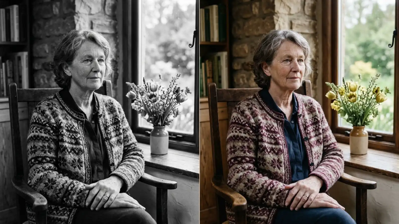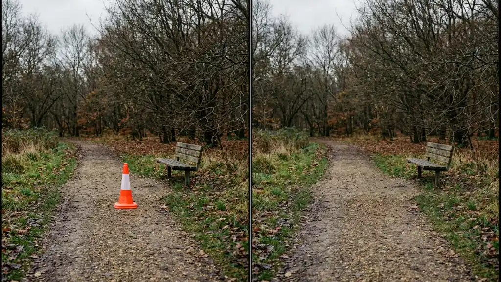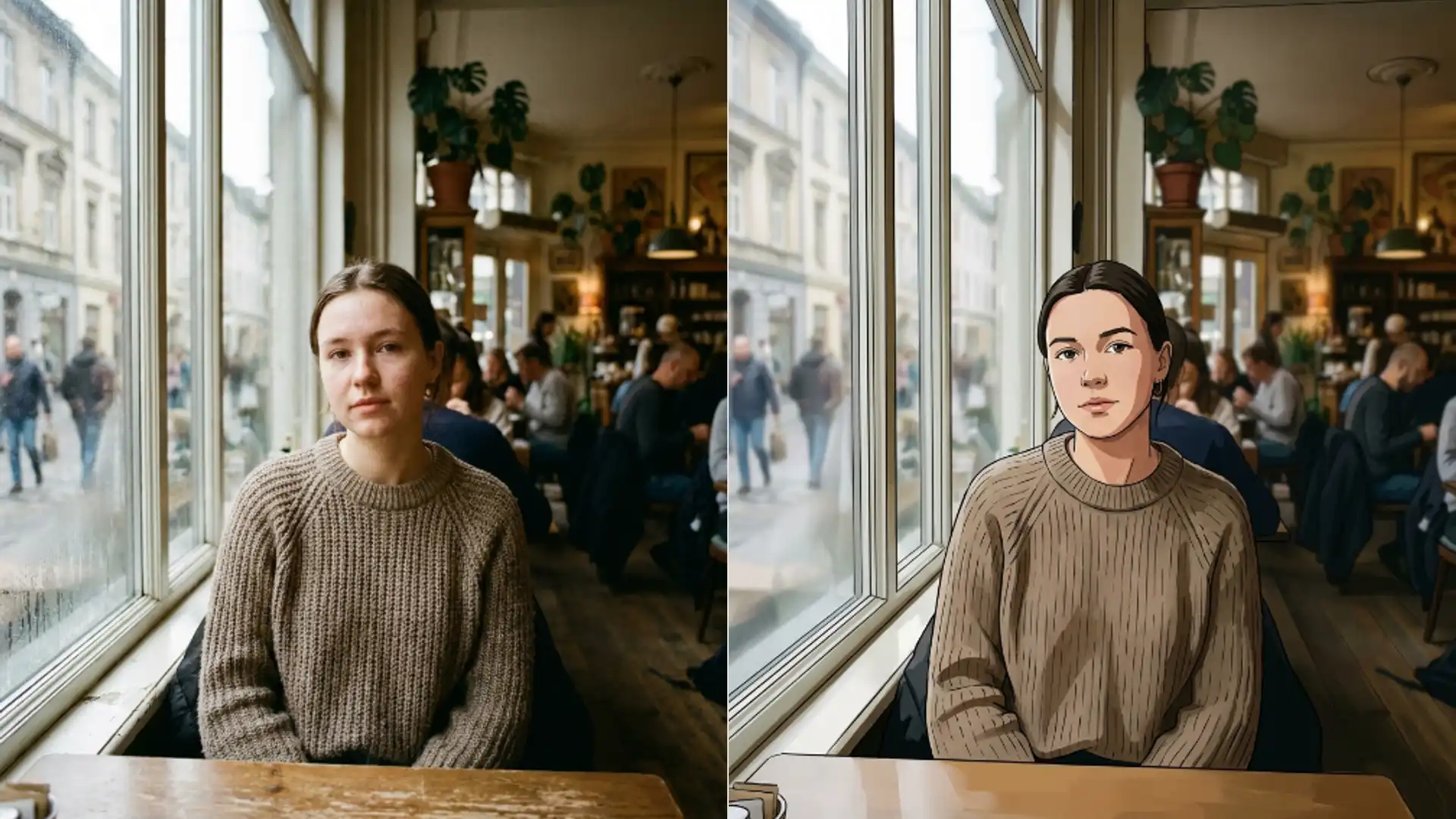
Picverce AI Photo to Anime styles and controls
All nine anime styles in Picverce AI Photo to Anime, which of them keep your face, what a run costs, and the photos that come back unusable.
GuidesThere is no prompt box in this tool. You upload a photo, tap one of nine cards, and that is the entire set of decisions available to you.
That sounds limiting until you understand what the cards are. Each one in the AI Photo to Anime tool is a fixed instruction written for that look, and picking a card is picking a whole paragraph of direction you never have to write.
So the useful skill is knowing what each card actually asks for. Here is the whole list.
The nine styles and what separates them
Nine cards ship in the picker. They are not nine shades of the same thing.
- Ghibli, soft hand painted watercolour tones with lush backgrounds and gentle shading.
- Shonen, bold clean line art with saturated colour and sharp highlights.
- Shojo, delicate lines, pastels, large sparkling eyes and flower motifs.
- Seinen, realistic proportions and a muted darker palette with complex shading.
- Chibi, oversized head, tiny body, large eyes, kawaii proportions.
- Manga, black and white ink with screentone shading, no colour at all.
- Webtoon, sharp digital line art and high contrast lighting in the Korean webcomic style.
- Cyberpunk, neon pink and cyan lighting against dark moody backgrounds.
- Realistic, semi realistic shading with anime eyes and natural skin tones.
Manga is the one people pick by accident. It is the only monochrome card, so if colour matters to you it is the wrong choice no matter how good the line work looks.
Realistic is the safest starting point. It stylises the least, which means it also fails the least visibly on a difficult photo.
When I first worked through all nine on the same headshot, the useful discovery was that Seinen and Realistic were close enough to be interchangeable, while Shojo and Chibi were doing something entirely different to the same face.
Why Chibi behaves differently from the rest
Eight of the nine cards carry the same underlying promise. They ask for the subject identity, the pose and the composition to stay intact, and for the facial likeness to survive the stylisation.
Chibi does not. It asks only for identity and the main features to stay recognisable, then deliberately rebuilds the proportions with an oversized head and a small body.
That is not a bug and it is not the model failing. It is the one card where distortion is the point.
The practical version is simple. If someone needs to recognise the person at a glance, avoid Chibi. If you want a mascot rather than a portrait, it is the only card that gets you there.
Everything else on the list is a restyle of your actual face. Chibi is a redraw of a character based on it.
What a run costs and what it takes in
Each run costs 3 credits. That is the same as the cartoon and sketch tools, and more than a standard cleanup pass.
Uploads are capped at 5 MB. Go over and it refuses before anything is sent rather than failing partway through.
Your file is converted to JPEG on the way out, so a transparent PNG arrives with its transparency flattened.
One difference from the photo cleanup tools is worth knowing. There is no megapixel ceiling trimming your image down before it is sent, so a large sharp photo reaches the model at the size you saved it.
That makes source quality matter more here than it does on the enhancer, where the input is shrunk anyway. A crisp 3000 pixel headshot genuinely gives the model more to work with.
If you hand it a style name it does not recognise, it quietly falls back to Ghibli rather than erroring. That only happens with hand built links, but it explains the occasional result that ignored your pick.
Where it struggles
The honest failure list is short and every item is repeatable.
Group photos confuse it. The instructions are written around one subject, so a second face in frame tends to get less attention and can come back subtly wrong.
Glasses are the common complaint. Frames survive, but the reflections and the exact lens shape often do not, and thin wire frames sometimes merge into the eyebrow line.
Very dark photos lose the most. Anime shading needs a readable face underneath, and a heavily backlit subject gives it almost nothing to stylise.
Hands anywhere near the face are worth cropping out. They are the single most common source of a result that looks almost right and then does not.
None of that is fixed by re running the same file. Change the input or change the card.
When the cartoon door is the better one
Nine styles is a deliberate, narrow set aimed at Japanese animation looks. If none of them is what you pictured, the AI Photo to Cartoon tool carries a much wider catalog for the same 3 credits, including 3D animation looks, watercolour and comic book styles.
There is real overlap between the two. Ghibli and Cyberpunk appear on both pickers, so those two looks are reachable from either tool.
And if the plan is to print the result rather than post it, size the source before you stylise. Working from something too small is the trap covered in fan art print from a small PNG.
Pick the card by the look you want, not by the one with the nicest sample image. The samples were made from photos that suited them.