A profile avatar from one headshot
One work headshot, four style runs, and the avatar that ended up on a team page. What Picverce AI Photo to Anime kept and what it quietly changed.
MarketingA small studio wanted illustrated avatars for their team page. Eleven people, one budget, and nobody willing to sit for an illustrator.
They already had headshots from a shoot the year before. That turned out to be the whole advantage.
Why the existing headshots worked
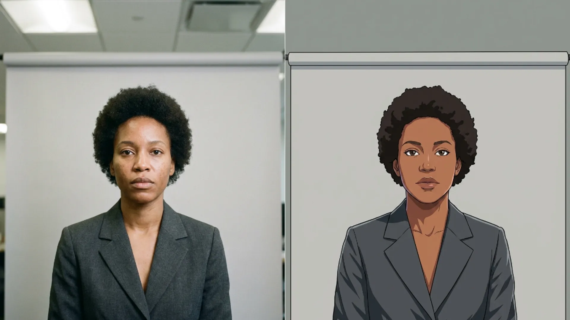
The photos were plain, which is exactly what a style pass wants. Even lighting, plain grey backdrop, everyone facing the camera at the same angle.
Consistency across the set mattered more than any single photo being beautiful. Eleven avatars that look like a set beat eleven that each look good on their own.
Each file was around 2 MB, comfortably under the 5 MB cap, and sharp enough that no cleanup was needed first.
I cropped every one to the same head and shoulders framing before uploading. Same crop ratio, same amount of space above the hair.
That single habit did more for the consistency of the final set than the style choice did.
Two of the eleven were shot slightly closer than the rest. I matched their crops to the others rather than keeping their original framing, and the set reads as one thing because of it.
Nobody looks at avatars individually. They see a row, and a row is only as good as its least consistent member.
Four styles on one face before committing
Rather than run all eleven and hope, I ran one face through four cards in the AI Photo to Anime tool. Four runs at 3 credits each is 12 credits to answer the question properly.
Realistic came back closest to the photo. Recognisable at thumbnail size, which is where these would actually be seen.
Webtoon was the most attractive as an image and slightly less like him. Cleaner lines, stronger lighting, a face that read as a character rather than a colleague.
Seinen was close to Realistic but darker and more muted. On a white team page it looked heavy.
Shojo was wrong for the context and I knew it before running it. I ran it anyway because guessing what a style does is how you end up guessing all eleven times.
Webtoon won. At the 96 pixel size the page actually used, its stronger lines survived the downscale where Realistic went slightly mushy.
That is the part I would have got wrong by judging on a laptop. All four looked fine at full size, and only one of them still looked like a person at the size the site rendered.
Test at the size the image will actually be shown. It is a thirty second check that changes the answer.
What it kept and what it changed
Across all eleven, faces stayed recognisable. Colleagues identified everyone correctly without labels, which was the only test that mattered.
Hair colour and rough hairstyle survived on every one. Length was occasionally shortened slightly.
Glasses were the weak point, as usual. Two people wore thin wire frames and both came back with heavier frames than they own. Nobody minded, but it was the one visible liberty.
Clothing became generic. Specific collars and patterns turned into plain shapes in roughly the right colour, which suited a uniform looking set fine.
One person with a beard came back with noticeably less of it. That is the kind of thing worth checking before you send a set out.
Total spend was 45 credits, twelve for the style test and thirty three for the eleven finals. Two people wanted a second run at a different card, which is where the last of it went.
Against an illustrator quoting per portrait for eleven people, that is not a close comparison on cost. It is also not the same product, and the team knew that going in.
What they got was a consistent set that looked deliberate. What they gave up was control over the details, because there is no way to ask for a specific collar or a particular fringe.
What I would do differently
Test on two faces, not one. The style that suited a clean shaven face in his thirties was not obviously the right one for everybody, and I found that out during the real runs.
Ask people about glasses first. A one line warning would have avoided two awkward conversations.
I would also test the sketch route next time. The AI Photo to Sketch tool costs the same 3 credits and its line work holds up unusually well at small sizes, which is the constraint that decided this whole job.
And I would look harder at the source photos before starting. What a cleanup pass does to grain and edges shapes every stylised result downstream, which is laid out in what the Image Enhancer does to noise and edges.
The job worked because the inputs were boring and identical. That is worth more than any card in the picker.