Wall art vs Poster Generator
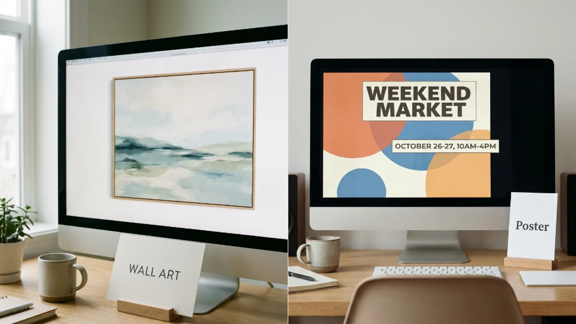
Two Picverce AI themes on the same workspace with very different style grids. Which door to open depends on whether the piece has to say anything.
RecommendationsBoth of these open the same workspace with a theme attached. Same models, same ratio tabs, same credit panel, same everything once you are inside.
What differs is the style grid you arrive with, and the two grids are not close to the same size.
Fifty styles against ten
The wall art grid is the larger one by a long way. The AI Wall Art Generator arrives with fifty presets plus a No Style option, most of them treatments rather than subjects.
The poster side is deliberately short. The AI Poster Generator carries ten presets plus No Style, and almost all of them describe a job rather than a look.
Read the poster names and the intent is obvious. Promo Sale, Luxury Brand, Festival, Product Launch, Minimal Clean, Vintage Poster.
Those are not aesthetics, they are briefs. Each one carries an assumption about what the picture is for.
The wall art names go the other way. Organic Modern, Color Field, Soak Stain, Tonal Litho are all descriptions of how something is made, with no opinion about what it says.
Two presets appear on both grids, Paper Cut and Pop Art, which is the small overlap between decorating a wall and advertising something.
That overlap is a fair description of where the two jobs meet. Both of those looks are bold, flat and graphic enough to work as decoration or as a message.
The real question is whether it says anything
That is the test worth applying, and it settles the choice faster than comparing style lists.
A poster communicates. There is a message, usually words, and a reason somebody stops to read it.
Wall art decorates. There is no message and nobody is meant to read it, which is why the presets are all about texture and palette.
So if your piece has to carry a date, a price, a band name or a product, you want the poster theme. Its presets are already arranged around leaving room for that.
If your piece just has to look right above a sofa, wall art. Asking the poster grid for something decorative gets you a layout waiting for text that never arrives.
The reverse mistake is more expensive. Asking the wall art grid for a promotional piece gives you something beautiful with nowhere to put the price.
Composition is the reason. Poster presets leave room in a way art presets deliberately do not.
Where both of them struggle
Words in the image, and it is worth being blunt about this before you spend anything.
The poster theme is arranged for text, but arranging for it is not the same as rendering it. Legible words inside a generated image remain the hardest thing to ask for and results vary a lot by model.
The common workaround is to generate the poster without the words and set the type yourself afterwards. That gives you a clean background and text that is actually readable.
Minimal Typography sits on the wall art side as a starter chip, which sounds like a contradiction until you use it. That look is typography as decoration rather than as a message, which is a different job again.
When I tried to get a short word rendered cleanly on both themes, neither did it reliably and the answer both times was to leave space and add the type in a layout tool.
That is not a failing of either theme. It is the general state of text inside generated images, and planning around it is faster than fighting it.
Which to open first
The short version, for when you do not want a process.
- Anything going in a frame with nothing to say, wall art.
- Anything with a date, a price or a product name, poster.
- A background you will add type to yourself, poster theme, then leave the words out of the prompt.
- No idea yet and just exploring a look, wall art. The bigger grid is more useful when you are undecided.
Neither choice locks you in. The theme sets your starting grid and you can change model, ratio and style freely once you are in the workspace.
Ratio is worth setting deliberately on both. Posters are almost always portrait, wall art depends entirely on the wall, and neither theme guesses for you.
Credits work identically across the two as well, following the model and resolution you pick rather than the theme you came in through.
So there is no cost argument for one over the other. The only question is which starting grid gets you there faster.
Choosing by output medium rather than by preference is the same discipline as the print decision in sketch vs anime for print.
Ask whether the piece has to say something. That one question picks the door for you.
And if the answer is that it says something quietly, like a single word as decoration, start on wall art and leave the type for later.