Wall art models and aspect ratios
Choosing a generation model for framed prints on Picverce AI, why resolution moves the price, and the ratio decision that has to come first.
AI ModelsWall art asks something specific of a model. The output gets printed large and looked at from close range, which is not what most generation is judged on.
That changes which model suits the job and it changes how much the settings matter.
Ratio is the setting that comes first
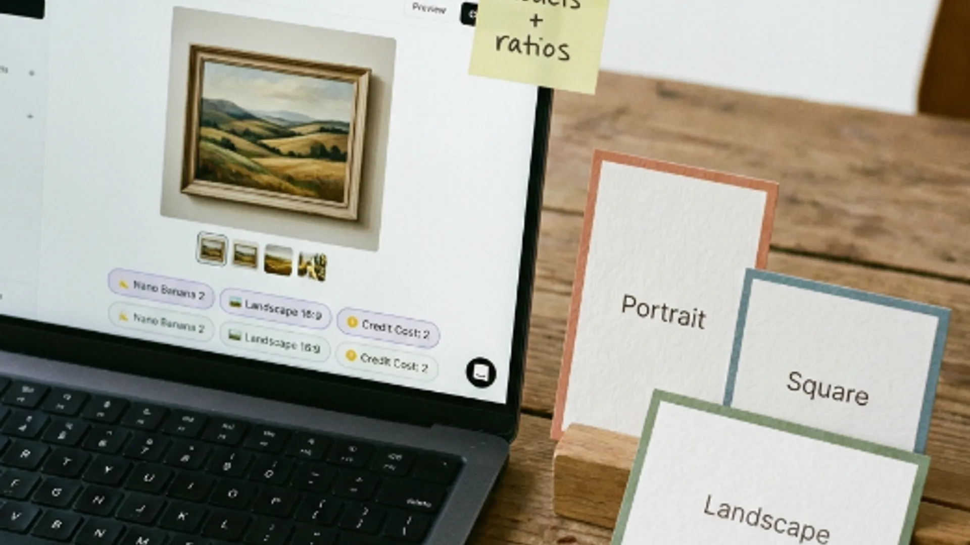
Three tabs, and they are the only shapes on offer. Portrait is 9:16, Square is 1:1, Landscape is 16:9.
A fourth option, Match Input Image, appears only when the model supports it and you have uploaded a reference. It is conditional rather than hidden.
Set the tab before you write a prompt worth keeping, because composition is arranged around the frame you gave it.
A square piece cropped to portrait loses the side margins that were holding it together. That is a regeneration, not an edit.
The ratio question is about the wall rather than the picture. Measure the space, or at least look at it, before opening anything.
Square is the forgiving default. It crops in either direction without the subject falling out of frame, which makes it the right first draft when the destination is not settled.
Resolution is what moves the price
There is no wall art credit rate. Generation is charged the way it is everywhere else in the workspace.
The settings panel shows a Credit Cost figure with the model and the resolution named directly underneath it. Change either and that figure changes.
Read that panel rather than remembering a number, because a number you remember will be wrong the moment you switch model.
Each model publishes its own resolution list, so what is even available to pick depends on which one you are on.
Variations multiply the cost and the cap on how many you can request is set by the model rather than by the theme.
The landing copy is straightforward that paid plans add higher resolution output, which for print work is the difference that actually matters.
What a printed piece needs from a model
Three things, and they point somewhere different from what a screen image needs.
- Clean gradients. Large flat areas are where banding shows on a print and never shows on a monitor.
- Edge quality. A soft edge that looks atmospheric at screen size looks like a mistake at a metre wide.
- Colour you can live with. Screens are brighter than paper, so a piece that looks rich on a laptop can arrive muted.
Gradients are the one to test first. Abstract wall art is mostly gradient, so a model that bands is a model you will fight the whole way.
When I compared three models on the same soft wash prompt at the same square ratio, the differences were almost entirely in how the colour transitions held together rather than in the composition.
That is the useful shape of model choice for this job. Composition comes from your prompt, and the model decides the surface quality.
It also means a model you rejected for portraits may be the right one here, because the thing that let it down there is not what this job is judged on.
Picking one without guessing
The catalog at the AI Models directory is the authoritative list of what is available and what each one accepts, rather than anything written here.
The families you will meet include Flux across several tiers, Imagen, Nano Banana, Ideogram and Seedream among others.
Rather than picking on reputation, run your real prompt on three of them at the lowest resolution with one variation. Credits follow resolution, so that comparison is cheap.
Judge only the thing that would ruin the print. For wall art that is almost always the gradients and the edges, not whether the composition is pretty.
A faster lower tier model is the right tool for drafting. Move up a tier once the prompt and the style are settled and you are producing the file you will actually print.
Ideogram is the one worth reaching for if the piece needs a word in it, though a word in a generated image is difficult on every model and leaving space for real type is usually better.
Reference images are the other capability worth checking before committing. Not every model accepts one, and the Match Input Image ratio option depends on that support.
How those families differ in general, and the cheap test that settles it, is covered in Flux vs Imagen vs Ideogram on Picverce AI.
And the theme itself changes none of this, because the AI Wall Art Generator hands you into the same workspace with a style grid attached rather than a different engine.
Ratio for the wall, resolution for the print, model for the gradients. Three decisions and they are easier apart than together.
Settle them in that order and the prompt becomes the only thing left to work on.