Picverce AI Wall Art Generator styles and ratios
The fifty style presets and three ratio tabs in the Picverce AI Wall Art Generator, what the theme changes, and the prompts that come back unusable.
GuidesWall Art is not a separate engine. It is the generation workspace opened with a theme attached, and that theme swaps the style grid for one built around art you would hang.
Typing a prompt on the AI Wall Art Generator hands you into the workspace with that theme already set, so you never pick it yourself.
Knowing what the theme actually changes is what makes the tool worth opening rather than starting from a blank prompt.
What the theme swaps
Three things arrive with you when you come in from the wall art door, and none of them exist if you open the workspace cold.
- Your prompt, carried straight through from the landing box.
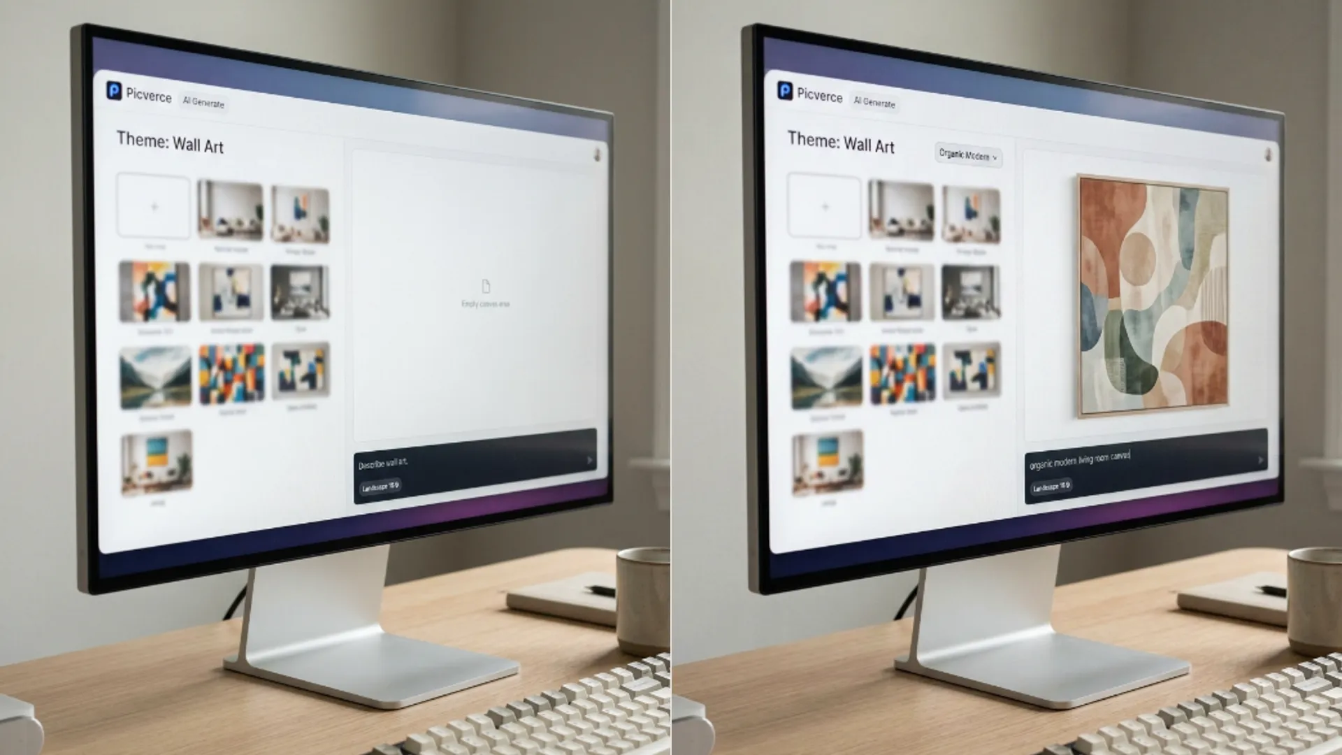
- A style grid of fifty presets, every one of them with wall art preview art rather than a generic sample.
- A photo you attached, held as a reference image for the first generation.
That last one is the part people miss. Attaching a picture on the landing page is not decoration, it becomes the reference the first run works from.
Everything else in the workspace is the same as any other generation. Same model picker, same resolution list, same credit panel.
So the theme is a starting position rather than a different product. You can change any of it once you are inside.
That is worth knowing because it removes a worry people arrive with. Nothing about coming in through the wall art door limits what you can do afterwards.
It also means a piece you started as wall art can become something else entirely without going back and starting again.
When I first came in from a starter chip I assumed the styles were locked to that theme. They are not, and switching model mid session works exactly as it does elsewhere.
Fifty styles and how to read them
The grid holds fifty presets plus a No Style option, which is more than anyone will scroll through honestly.
They sort into four rough families once you stop reading them one at a time.
- Abstract and painterly. Organic Modern, Sharp Abstract, Color Field, Soak Stain, Soft Wash Art, Paper Layers. The ones actually designed for a wall.
- Ink and print. Ink Fusion, Tonal Litho, Sumi Modern, Ink Minimal, Paper Cut. Flatter, more graphic, cheaper to print.
- Decorative and thematic. Neo Deco, Folk Modern, Celestial Mood, Celestial Glow, Rousseau Dream. A look with a subject attached.
- Illustration and genre. Watercolor Wash, Charcoal Sketch, Baroque Oil, Stained Glass, Origami Art, Low Poly 3D and the rest.
The first family is where the tool is genuinely strong. Those presets were built for something you frame, and it shows in how they handle empty space.
The fourth family is the widest and the least specific to wall art. Several of those looks exist to serve other jobs and happen to be reachable from here.
No Style is worth using more than people do. A carefully written prompt with no preset often beats a vague prompt wearing a strong one.
The reason is simple. A preset adds its own instructions on top of yours, and if your prompt was already specific those two sets can pull in different directions.
Try your prompt on No Style first. If it comes back close but flat, then reach for a preset to give it a treatment.
The previews on each card are worth trusting more than the names. Every one of the fifty carries its own wall art sample rather than a generic thumbnail, so what you see is roughly what that preset does to a piece meant for a wall.
Scrolling the grid once slowly is a better use of two minutes than trying six presets and comparing outputs.
Three ratio tabs and the fourth option
Ratio is the setting that matters most here and the one people set last, which is backwards.
There are three tabs. Portrait gives you 9:16, Square gives 1:1, and Landscape gives 16:9.
That is the whole list. There are no inch presets, no A sizes, and nothing that mentions a frame by name.
A fourth option appears conditionally. Match Input Image shows up only when the model you picked supports it and you have actually uploaded a reference image.
If you cannot find that button, one of those two conditions is unmet. It is not hidden behind a plan.
Pick the ratio before you write anything worth keeping. A composition arranged for a square does not survive being cropped to a tall frame, and regenerating is cheaper than pretending it will.
Square is the safest default for a first draft, because it crops in both directions without losing the middle of the subject.
For anything going above a sofa, Landscape. For a stairwell or a narrow alcove, Portrait. That decision is about the wall, not the picture.
The tab also changes the little preview shape next to it, which sounds trivial and is the fastest way to confirm you actually changed it.
People set a ratio, get distracted by the style grid, and generate on the default. Glancing at that shape catches it.
What a run costs
There is no wall art price. Generation is charged the same way here as anywhere else in the workspace.
The settings panel shows a Credit Cost figure with the model and resolution named underneath it, and that figure moves when either changes.
So the honest advice is to read that panel rather than to memorise a number. Two runs on the same prompt can cost different amounts because you changed the resolution between them.
Variations multiply it. How many you can ask for at once is decided by the model rather than by the theme.
Each model also publishes its own resolution list, so the choices available to you change when you switch. A resolution that existed a minute ago can simply not be there.
The landing copy is clear that free credits cover generating, an account raises your limit, and paid plans add higher resolution output along with more generations per day.
Paid plans also carry commercial rights for selling prints and decor made from your generations, while free credits cover personal use. That distinction matters more here than on most tools, because wall art is the one people actually try to sell.
The per model settings behave identically to the rest of the generation workspace, including which options appear at all.
If the way resolution drives the price is new to you, that mechanism is laid out in Picverce AI Image Generator workspace.
Where it comes back unusable
Four failures repeat, and all four are about the prompt rather than the tool.
Busy prompts are the most common. Wall art wants one idea, and a description with a subject, a season, three colours and a mood produces a crowded picture that reads as noise on a wall.
Cut it down to a subject and a palette. Two clauses beats five almost every time.
The second failure is a style fighting the subject. Asking Sharp Abstract for a recognisable mountain gives you neither, because the preset wants to break the shape and your prompt wants to keep it.
Pair abstract presets with abstract prompts and representational presets with real subjects. The moment they disagree, the preset usually wins and your subject dissolves.
The third is text. Wall art prompts that ask for a word on the canvas are asking the hardest thing a model does, and most attempts come back with letter shaped decoration.
The fourth is ratio regret. A piece composed square and later needed tall is a regeneration rather than a crop, because the empty space that made it work was on the sides.
A fifth worth naming is the reference image that nobody meant to attach. A photo you added on the landing page carries into the first run, and if you forgot about it the results will keep echoing a picture you are no longer thinking about.
Clear it if you did not want it. That one accounts for a surprising number of results that feel inexplicably off.
When I ran a misty lake prompt through four presets on the same square ratio, the two painterly ones were usable and the two graphic ones flattened the water into a band of colour. Same prompt, same ratio, and the preset made the whole difference.
Pick the ratio for the wall, keep the prompt to one idea, and try No Style before you reach for a preset. That order avoids most of this.