Sketch vs anime for print
Both cost 3 credits and both restyle a photo, but only one of them reliably survives being printed. Which Picverce AI tool to open for paper.
RecommendationsOn screen these two tools look like a matter of taste. On paper they are not, and the difference comes down to how each one builds the image.
Line against shading
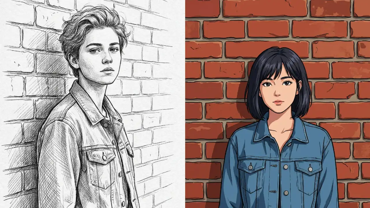
The sketch route draws. The AI Photo to Sketch tool finds edges in your photo and turns them into marks, leaving most of the page empty.
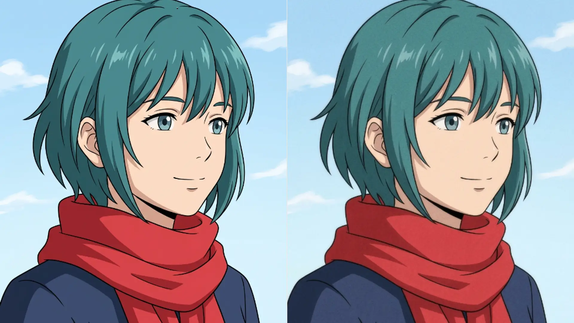
The anime route shades. The AI Photo to Anime tool fills areas with flat colour and soft gradients, and the outline is only part of the picture.
That difference decides everything about how they print.
It also decides what the file looks like. Line art compresses down to very little because most of the page is one colour, while a shaded anime frame carries far more information.
For a web page that is a real difference. A line drawing can be a fraction of the weight of a shaded illustration at the same dimensions.
Line art is mostly white paper. Ink coverage is low, which means cheap printing, fast drying, and no banding.
Anime output is mostly filled area. Large flat colours are where cheap printing shows its problems, and gradients are where banding appears.
What happens at small sizes
Shrink both and they fail in opposite directions.
Fine line art disappears. Marks thinner than the press can hold either vanish or fill in as grey, and the drawing loses its structure.
Anime holds together far better small, because a filled shape stays a filled shape no matter how much you shrink it.
So the rule reverses depending on size. Large print favours sketch, small print favours anime, and heavy line sketch is the compromise that works at both.
When I printed the same face both ways on a business card, the anime version was still readable and the fine line sketch was a smudge.
At A3 the result flipped completely. The sketch had detail worth looking at up close and the anime version showed its flat areas as flat.
Neither tool was better. The size was doing the deciding both times.
The useful habit is to fix the output size first and pick the tool second. Almost everyone does it the other way round and then blames the result.
Write the finished dimensions on a note before you open anything. It sounds fussy and it settles most of these arguments in advance.
Paper stock changes the answer
This is the part people skip and then blame the tool for.
- Uncoated and textured paper spreads ink. Fine lines close up, so use heavy line sketch or anime.
- Matte coated holds line work well and mutes anime colour slightly.
- Gloss keeps anime colour vivid and can make heavy line art look harsh.
- Any recycled or rough stock: assume you lose your two finest line weights.
Ask the printer for the stock before choosing the tool. It is a one line question that saves a reprint.
Single colour printing is the other constraint worth naming early. Screen printing one ink means anime output has to be reduced to a single tone, which usually destroys it, while line art was already almost there.
If you know the job is one colour, the decision is made before you open either tool.
Embroidery has the same shape of constraint, only stricter. Stitch counts favour bold simple shapes, so heavy line sketch is usually the only viable route.
Anything cut from vinyl behaves the same way, because a cutter needs closed shapes rather than shading.
Which to open for a given job
For a wedding invitation, save the date, or anything with text around it, sketch. The white space is the point and it prints cheaply.
For a poster or anything larger than A4, sketch again, and this is where the fine line cards finally earn their detail.
For stickers, business cards, badges, or anything small, anime. Filled shapes survive the size reduction that kills line work.
For a T shirt, anime if the printer does full colour, heavy line sketch if it is a single colour screen print.
Neither tool has a strength control, so you cannot soften an anime fill or thicken a sketch line. Choosing the tool and the card is the whole decision.
The two tools are otherwise identical in how they run, the same way the anime and cartoon pair is, which is laid out in Photo to Anime vs Photo to Cartoon.
Both cost 3 credits, cap at 5 MB, take a single style choice, and neither will repair a bad photo before styling it.
Both also skip the size trim that the cleanup tools apply, so a large sharp source reaches either model intact. For print work that is the difference between usable and not.
Print one proof before ordering a run. That habit has saved more of these jobs than any card in either picker.