Cut a product onto white
A step by step run for putting a product on a clean white background with the Picverce AI Background Remover, and the edges worth checking after.
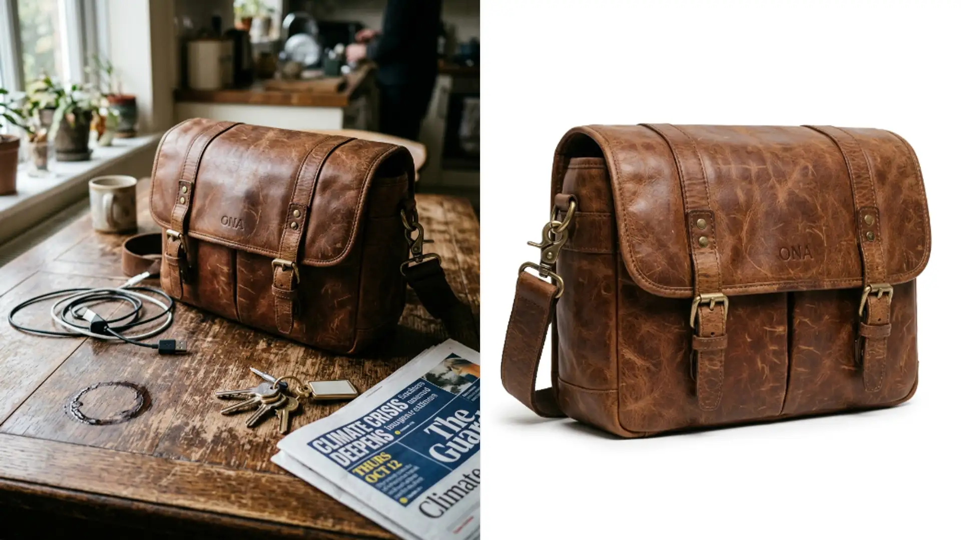
TutorialsMost marketplaces want a product on plain white. Most product photos are taken on a kitchen table.
Closing that gap takes one pass and about a minute, and the fiddly part is not the cut itself.
The cut gives you transparency not white
This is the step people get wrong first. The AI Background Remover returns a PNG with a transparent background, not a white one.
Transparent and white look identical on a pale web page. They are completely different files.
Open the file on a dark background once and the difference is immediately obvious. That is the quickest way to confirm which one you have.
That difference matters at upload time. Some marketplaces accept transparency and composite it themselves. Others reject the file or fill it with something you did not choose.
Check what your destination wants before you batch fifty images. Finding out afterwards means doing the composite step fifty times.
So the cut is step one of two. You still have to put the subject on an actual white layer afterwards, in whatever editor you already use.
Keeping the transparent version is worth doing anyway. One cutout can sit on white for a listing, on a colour for a banner and on a photo for a social post.
When I redid a set of ten listing photos, saving the transparent files first meant the seasonal recolour later was a copy and paste rather than ten more passes.
Save the transparent PNG as your master and export flattened copies from it. That is the habit that stops you paying for the same cut twice.
Shoot for the cut
Five minutes of care before the upload saves more time than any amount of fixing after.
- Separate the product from whatever is behind it. A dark bottle on a dark worktop has no boundary to find.
- Light the edges. A rim of light around the subject is the single most useful thing you can give the cut.
- Avoid shadows touching the product. A shadow joined to the subject often comes along with it.
- Skip the busy backdrop. A patterned tablecloth makes every edge decision harder.
None of this needs a studio. A sheet of paper and a window does the job for small items.
Contrast matters more than brightness. A pale product on a dark cloth cuts as well as a dark product on a pale one.
What does not work is a background the same tone as the subject, whichever tone that is.
Uploads are capped at five megabytes, so a phone photo goes straight through and a large camera file may need shrinking first.
Each pass costs two credits, which makes trying a second shot cheaper than arguing with a bad one.
Accepted formats cover the usual set, so a phone JPEG, a PNG or a WEBP all go straight in.
Check four edges before you use it
A cutout looks perfect at thumbnail size and falls apart at full size. Open it properly.
- Fine detail. Handles, straps, wires and anything thin are where a cut most often breaks.
- Transparent parts of the product. Glass and clear plastic confuse the boundary, since the background shows through them.
- Contact points. Where the product meets the surface is where a shadow gets kept or the base gets trimmed.
- A dark fringe. Put the cutout on a white layer and any leftover halo from the old background shows immediately.
That last check is the reason to composite onto white early rather than last. A fringe you cannot see on grey is obvious on white.
If the edge comes back rough, reshoot with better separation rather than running the same file again. The cut is reading what it was given.
Running the identical file twice gives you close to the identical cut. There is no random element to roll again.
The variable you control is the photo, which is why five minutes with a lamp beats five more passes.
Make it listing ready
Two things are left after the cut and the white layer.
Give the product margin. A subject jammed against the frame edge looks cramped in a grid of other listings.
Keep the same margin across every photo in the set. Consistency across a listing reads as professional more than any single image does.
Pick one canvas size for the whole set too. A grid of thumbnails at mixed proportions looks careless even when each photo is good.
Square is the safe default for a marketplace grid, and it is what most of them crop to anyway.
If the original was small or soft, run it through the AI Image Upscaler before the cut rather than after, since a cleaner edge is easier to find in a larger file.
Order matters there. Upscaling a cutout can make a rough boundary more obvious instead of less.
The same logic applies to any repair. Mend the photo, then cut, then composite, then resize if you still need to.
Doing it out of order is how a small flaw becomes the thing everyone notices.
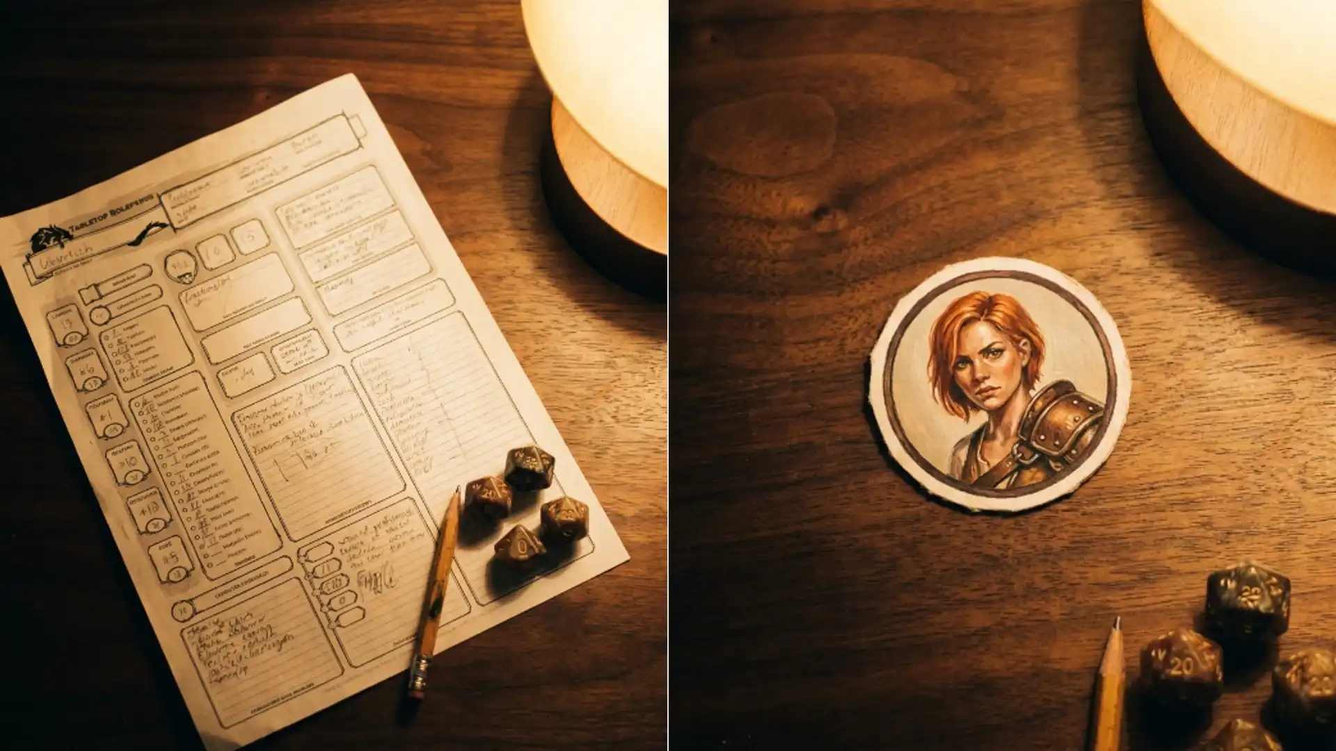
The same cut and composite step shows up at the end of a character token build, which is walked through in make a token from a character sheet.
Separate the subject, cut, composite onto white, then check the thin bits. That order is the whole job.